One of the projects we’ve been working on in my Visual Design class, taught by Elizabeth Wolfe, is a packaging design project. We had to conceptualize or choose an item to make a package for. One of the things I love to do for projects like this is dive into ChatGPT – which I have trained to be an absolute goblin, just like myself – and ask it for ideas. The resulting conversation leads in some wild directions, usually, but it also comes up with some neat ideas!
This project was born from a ChatGPT conversation. My ideas were to do something that would be goblin core or green witch aesthetic. I was thinking cottage in the woods, herb garden, mushrooms, wild things…and ChatGPT suggested to me the idea of making luxury matches. I ran with this idea, full tilt, because my next question to ChatGPT was “yikes, but what could we do about the sulfur smell from striking matches?” The AI suggested that we scent them – and the idea was born. I have a whole list of scents that I think would be amazing for a match to produce when struck.
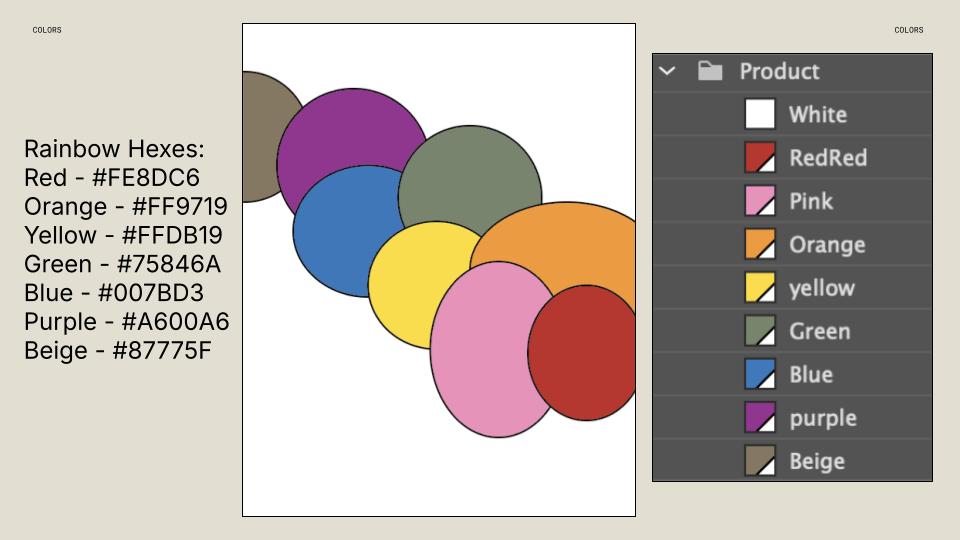
Because one of my favorite colors is green and the idea to print on a recycled paper package became my focus, I picked a sage green color to be the base for this design. Because I went with green I picked the mint and eucalyptus flavor that was listed as the green of my goblin core match project rainbow.
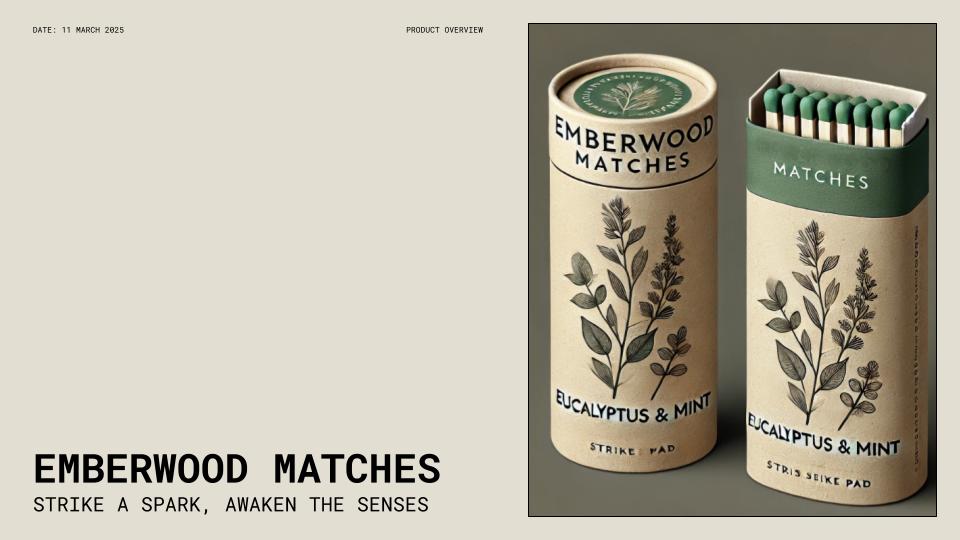
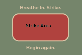
Here’s the mockup that the AI made when we were discussing names, flavors, colors, and other considerations:

Pretty intense mockup, honestly. I loved the idea here, and went to work on my own mockup design, using my plan from our class exploration time as a template and design inspiration board.
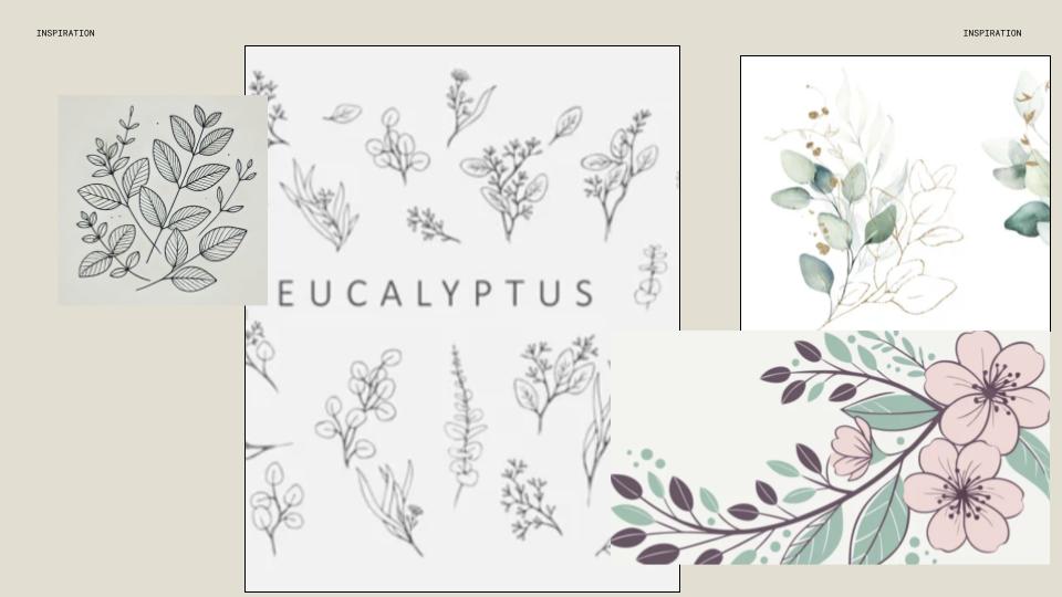
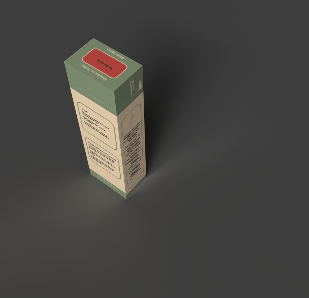
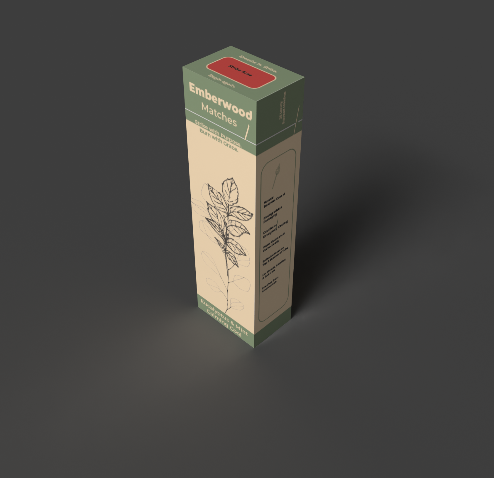
One of the first things I did was grab some images from Adobe Stock. I wanted a sprig of both eucalyptus and one of mint to be featured on the front of the package instead of the AI hallucination of plants that ChatGPT used. I also wanted to have panels on the sides for some brand story information, and a panel on the back to explain that the packaging would serve as an emergency firestarter since it would be made out of recycled paper.
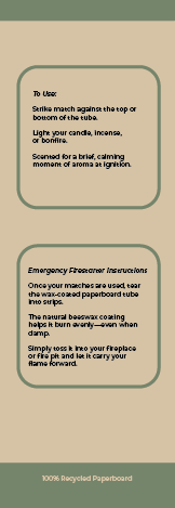
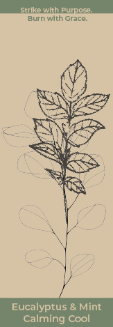


These panels were a lot of fun to work with, I even added in a top and bottom panel to serve as strike areas for the matches. I enjoyed brainstorming the brand name, too, and I picked Emberwood because it speaks to me of fire and wild growing things, which is very brand appropriate for these matches.
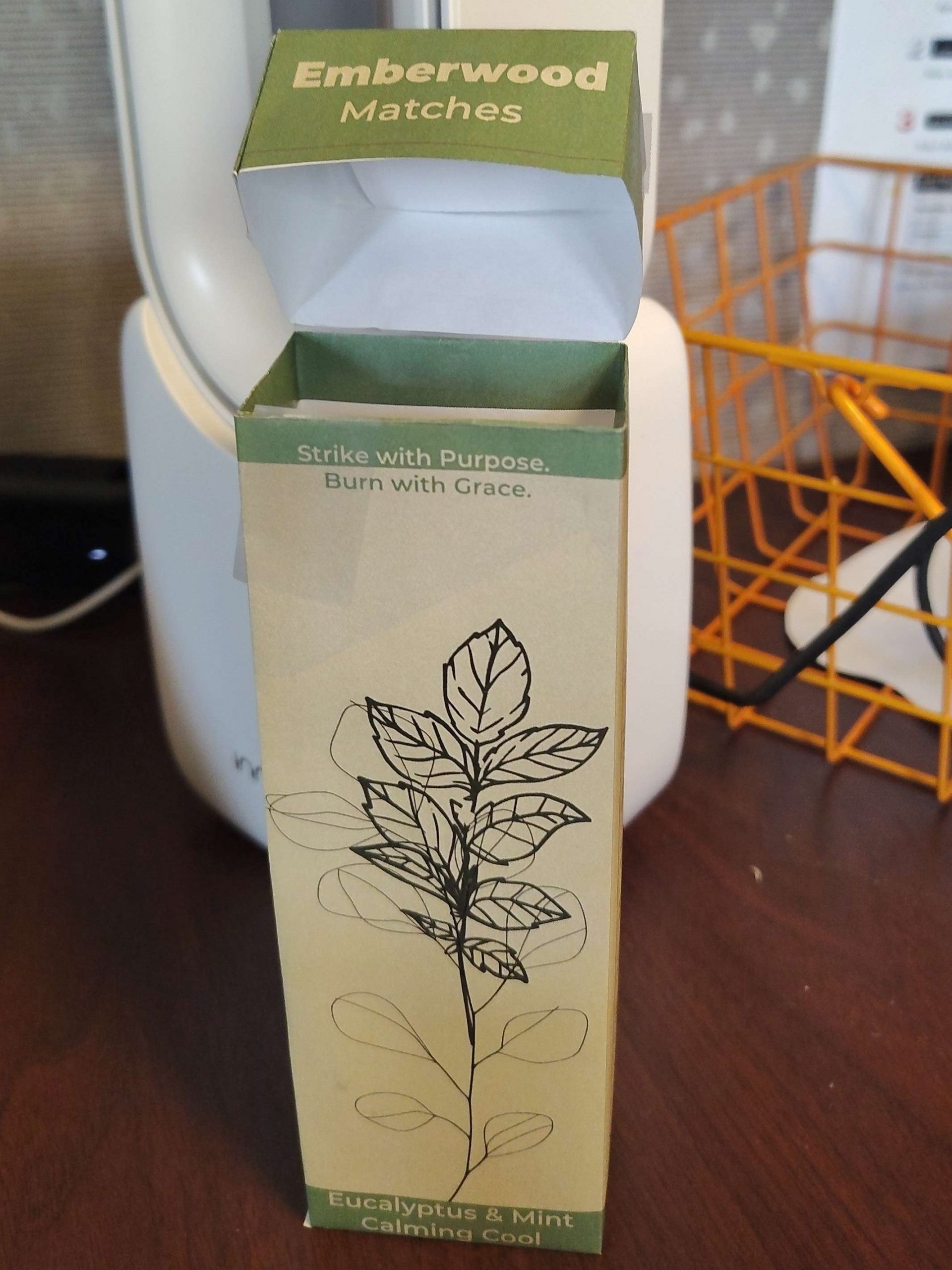
I even made my own paper mockup of the. box, which took much tape to put together, but was a fun experiment in the act of making. I love how the colors work together, even if the recycled paper feel of the packaging wouldn’t match the color I used as the background exactly. I think it came out lovely. I’m a little sad that the eucalyptus and mint pictures don’t really match up in their line weights, I think it would’ve looked much better if the two had looked more cohesive here, like they were both growing out of one stem. (The match has both scents, thus it made sense to me to have them growing from the same stem!)
Anyways, this one was a lot of fun, I really enjoyed making the dieline and everything for this project. Also, learning a little bit about Adobe Dimension was nice as we made digital mock ups and rendered them. Here’s my final renders: