4 October
Start of project, I’ll be working with Zach!
We have picked several methods from the Big Bible of Methodology to use for our Quantitative Data collection. The first one is #50 – Kano Method from page 241. Next we have the AEIOU method, #2 from page 14. Third we have Affinity Diagramming, #3 from page 19.
Martin, Bella, and Bruce Hanington. Universal Methods of Design: 100 Ways To Research Complex Problems, Develop Innovative Ideas, and Design Effective Solutions. Rockport Publishers, 2012.
7 October
After the class I missed, Zach picked out a few more methods for us to work with, #22- Critical Incident Technique, #35- Evidence-Based Design, #74- Secondary Research, and #78- Site Search Analytics. These are all the methods that use the first stage of the design process, which I believe was covered during the lecture.
10 October
We have chosen to stick with the three we picked during the first class for our project after talking to Dr. Stricklin regarding the methods we needed to use. She was less concerned with them being specifically designed for quantitative work and more concerned with us using them in a quantitative way, which we will be attempting to do as we move forward.
11 October
Project Methodology
Methods and Processes
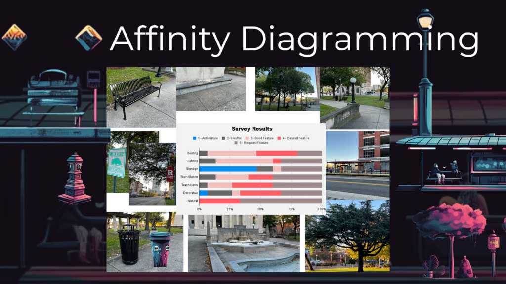
We will combine three methods together for the framework, collection, and codification of the data we will collect. First we will use AEIOU to better define the artefacts we will collect, how they will be grouped, and the processes we will use. This will help us keep our data collection organized, keep our project on track to ensure timely completion, and help us keep these data in their containers so they can be easily accessed for processing after collection has been completed. Next, we will use the KANO method for the feature analysis. This method introduces if features are necessary, make the users happy, or are anti-features. Because of this, it will make it easy for us to understand the data we collect from users about the features we select to include about the park. Finally, we will move into the Affinity Diagramming method, where we will visually represent the data we collect from our surveys. Instead of making a lengthy report we will focus on using a diagram much like the mood board to show our results.
2. AEIOU – pg 14
This is a framework for our data collection process. The letters stand for:
- Activities
- Environments
- Interactions
- Objects
- Users
We will use this one to design containers for our data that we will collect.
Activities
- Set the area for our research.
- Decide the features we want to collect information on.
- Create a survey to hand out to people; or, one that we can just use “hash marks” to collect the answers as we ask the questions in person. This can also be made into a link we can use a QR code to send people to for them to complete the survey remotely.
- Distribute the survey.
- Ask people in person
- Hand out QR code
Environments
- Collect pictures for artefacts that will be surveyed.
- Define the area on a map and screen shot.
- Minor goal: Track what part of the park people are surveyed in to quantify where the data is collected. (Mostly at train? Mostly near benches?)
Interactions
- How are the features used by the users?
- What features are used most?
- What features are excitors or detractors?
Objects
This will be a container for the features we decide to focus on.
- Benches
- Trashcans
- Lighting
- Decorative
- Signage
Users
These will be the anonymous people we survey. No data will be collected to identify them. Potential collection of if they are Rutgers related or community related, but no identifying features beyond this.
50. KANO Method – pg 241
This is the method we will use to organize our quantitative data collected through the surveys.
- Required – 5
- Desired – 4
- Exciter/Delighter – 3
- Neutral – 2
- Anti-feature – 1
On each survey there will be a scale of 1-5 where people can score the different features selected. Based on the answers we will codify the number of participants who select each option for each feature.
3. Affinity Diagramming
This method will be used to graphically represent the data collected from the surveys. We will make a mood board type item and have one section for each item surveyed. Pictures of the feature will be included as well as the survey answers for the data. Further suggestion would be to collect multiple digital artefacts of the features to support the data from the surveys. (If benches become highly popular, then pictures including people using them – if trash cans become a big one, then images of the trash levels at various locations and times may be included.

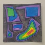
Something like this, but probably less hectic. To solve the issue of personal identification in these images, we will ensure all images used are blurred so that identification is not possible.
13 October
Feature Selection and Survey Design
This is the full list of features that we talked about, which will be reduced to make the survey shorter and easier to deliver.
Features:
- Architectural Seating along the building.
- Stone benches
- Stone Fences
- Wooden Benches
- Lighting
- Metal Benches with anti-homeless people arms.
- Trash cans
- Squirrels
- Doors/entry ways
- Stairs/ramps
- Train stations
- Waiting areas
- Ticketing booths
- Ticket scanners
- clock/schedule led bars
- Statues
- Pergolas
- Wading pool
- Signage
- Rutgers sign
- Library sign
- Historical sign.
- Mural (covered)
- Trees
- Sidewalks
- Lawns
14 October
We have decided (with very strong influence from Dr. Stricklin) to reduce the number of features, so our previous list has been grouped into broader categories.
Reduced List:
- Seating
- Lighting
- Signage
- Train Station
- Trashcans
- Decorative
- Natural Objects
17 October
The Survey of DOOM!
Or, the survey we plan to use to gather data for our Kano method. The answers will be ranked 1-5 which will determine if the feature’s rank.
Survey Use:
The researcher who is delivering the surveys and noting the answers will put a hash mark in the box corresponding to the answer given. These marks will be tallied and added to this document for tracking of total responses.
Survey Final:
Please rank the following items on a scale of 1 to 5.
Required Feature – 5, Desired Feature – 4, Good Feature – 3, Neutral Feature – 2, Anti-feature – 1
- Seating
| 1 | 2 | 3 | 4 | 5 |
- Lighting
| 1 | 2 | 3 | 4 | 5 |
- Signage
| 1 | 2 | 3 | 4 | 5 |
- Train Station
| 1 | 2 | 3 | 4 | 5 |
- Trashcans
| 1 | 2 | 3 | 4 | 5 |
- Decorative
| 1 | 2 | 3 | 4 | 5 |
- Natural Features
| 1 | 2 | 3 | 4 | 5 |
Survey Results:

Affinity Diagram:

Qualitative Study Methods
Based on our need for more information from the users, we have picked the following Qualitative Study methods:
Survey
Interview Questions:
- How do you feel about Johnson Park and the features here? (e.g. the seating, lighting, decorations, signs, etc.)
- What features do you think are not needed?
- What features do you think could be added or improved on?
Case Study:
Each interview was treated as a separate case and was codified based on themes that showed up in the interview answers.

Content Inventory and Audit:

This is the frequency chart generated by codifying the data we gathered from our interviews.
Conclusion:
Zach and I concluded that if there was one thing we could actually do an intervention for, given our lack of funding and institutional support, it would be helping raise awareness about the park. We will focus our next project on interventions we can do without upsetting the administration or city to help raise awareness of Johnson Park, what it is available for, who it is available to, and why people should check out our events.