16 September 2024 – In Class
100 Uses for Paperclips
Today’s assignment was a preparation for brainstorming in creative ways, much like we saw in the news story about the team designing shopping carts. The theory here is that thinking outside of the box, or to quote Keller Easterling, assigning new affordances, can help put one in a creative mind-frame to create a more robust iterative design process. This was a fun and challenging exercise. Professor Stricklin said the first 25 would be easy, the second 25 would slow down, the third 25 would be hard, and the final 25 would be a true challenge. I found this to be mostly true, but I powered through the first 76 with aplomb and only really struggled with the final 10 or so, some of those taking longer to think up, and then ensuring I hadn’t already used them.
Brainstorming Concepts
After talking about our top picks for the paperclip assignment, we spoke about the importance of pushing ourselves hard in the conceptualization phase of design. Even bad ideas should be at least spoken, written down, and considered because they can lead to a different angle to approach the problem/redesign/design, and perhaps create the idea that ends up working best.
In pairs we worked on brainstorming ideas for our first project; the goal was to come up with at least 50 different transitional spaces or events that could be used to make maps. I worked with Kayla and we ended up with around 54 ideas. The one that struck both of us pretty strongly was “Chaos to Peace.”
Concept Thumbnails
After the brainstorming process we made 10 thumbnail concept drawings for the three maps that are due next week. We went around and talked about the different concepts we had come up with, and although I had fun doing some weird ones (Chaos to Peace Pizza), I settled on doing a ‘wind map’ design, a topographical map, and a more traditional map.
19 September – Work at Home
Today I started working on my maps, pulling all of my creative tools out of the closet and dusting them off for experimentation. One thing I am excited to try is to use watercolor paints to create a tie-dye pattern. This ties into the peace segment of our transition (for me, at least) by being tied to the “love/peace” movement of the 1960s. My initial thought is to make this the base for the topographical map, but I will see how the design develops as I experiment with this technique.
I feel a strong pull to paint the backgrounds of these maps and use Sharpie or another strong pen to draw in the details and designs of the map surface. There’s also a desire to tie in some pins and yarn I have around the house to make the maps more compelling and add flare to the otherwise flat surface of paint on paper. So, I spent some time conceptualizing things in my mind, ordered some cork board 12×12 squares to mount my maps on, and collected my supplies for the work.
There was some time dedicated to working on my 10 concept thumbnails, as well, which had some pretty interesting ideas. One thing I would like to do is use broken glass, an idea Kayla had, to somehow help emphasize the unpredictability of “chaos.” The only issue I have in this is that I don’t have any glue that’s appropriate for this endeavor, and I forgot to put it on my Amazon shopping order.
20 September – Work at Home
Art supplies came in today. I was very distraught that the “3 pack” of cork boards wound up only being one. Because of this, I will likely only mount the traditional type map, which will rely heavily on map pins and butterfly push pins to help drive the narrative of the piece.
The watercolor experimentation went quite well, and I have a lovely spiral pattern of tie-dye colors that I have tried to pattern more aggressive colors together towards the spiral and more calm colors in the straighter lines along the side. The final color along the edge of the paper is yellow because I am thinking a lot about sunflowers and how they kind of go along with peaceful afternoons and summer warmth. After looking at the pattern, I have decided to change this to the wind map style. The pattern of the tie-dye would clash too much with the contour map design, and as I look at the spiral I feel like it looks very reminiscent of a tornado’s Doppler patterning, although the colors are now completely wrong for it – the design shows the intent and can be altered in a later iteration if needed.

The use of acrylic to produce the topographic map may have been a bad choice. The weight of the paint on the paper is making it curl as it dries. However, I’ve already committed to this medium, so I will follow through with it.

The chaotic section of the more traditional map was so fun to create. I used some watercolor techniques to make the paint spread out – similar to the tie-dye technique, but something I learned when making cherry blossom images several years ago. The unfortunate thing here is that the black I was hoping to be the base for this section didn’t go well, as watercolor black often fades to a more gray tone. I loved splashing red into this mix to add to the chaos section, so I used that method on the blue/green section that represents a watery crossing between chaos and peace. Because the watercolor paint was not bold enough, I went over the “peace island” with acrylic paint. This not only had the desired effect of making the land look verdant, it also had the unintentional effect of making a clear delineation between chaos, transition, and peace by making the lines bold and very clearly drawn.

21 September – Work at Home
Today’s work includes pinning yarn to the traditional map, adding in pins and decorations, and layering paint on the topographical map to show “height” differences. I have decided that the base will be chaos, and as the layers move “upward” they will represent peace through acceptance. The color choices for the topographical map are going to be a reverse rainbow – so starting with purple and working backwards towards red. Ending with red, I think, will capture the attention of the viewer. This will represent the chaotic journey of growth that has led from me hiding in the chaos to being comfortable enough with who I am and knowing my worth enough to be myself.
While working on the topographic map, I realized I don’t have a purple acrylic paint. When I tried to mix the paints it was coming out too dark or too red/pink. Unfortunately, I’m not very good at color theory, so I wasn’t comfortable doing much to produce an actual deep indigo/purple color. I attempted to use watercolor paint without diluting it in water – but the result was a flat and hard to differentiate color. I think choosing such a dark color for the base was perhaps not the best idea I’ve ever had. In retrospect, a lighter color would’ve worked far better here as the map is starting to take on an overall sinister look from the dark colors.
The traditional map has some pins in addition to the butterflies, stars, and map flags I bought to make this map have more depth. One pin says “out of luck” and will be placed in the chaos section, this is a direct reference to the traumas I experienced early in life, which is a strong reason why I have decided to make this map based on my life from childhood to now. There’s a pin that says “regret everything” which will be towards the center of my journey away from chaos – my teen years where I rebelled against the world in an attempt to escape abuse and trauma, and only resulted in everyone calling me a liar and not trusting me. Finally, I added a couple of artistic pastel colored pins that have cute animals in the peace area of the map. These cute, non-threatening pins help highlight peace to me.
22 September – Work at Home
Today I am finishing up the three map prototypes. The one that needs the most help is the topographic map, which has taken longer to produce because of the dry time between the layers. I tried to rush it between purple and blue and ended up causing the paint to chunk up in places. So, I will not use the hair dryer or any dabbing techniques to rush the drying process, and it will take a while to finish getting through the different color layers.

The maps are all completed to the best of my very limited abilities. I’m a little sad at not being able to find a good sharpie or other pen to do the outlines on my maps and the arrows on the wind map. The lines and shapes of the arrows on the wind map look terrible: difference in size and shape, difference in length and widths of lines, and just an overall inconsistency you wouldn’t see in a normal wind map. Without a sharpie I also tried to line the layers of the topographic map, but the black paint I was using became gummy and dried out a bit too much, so it was not really helpful at all. I gave up after outlining only the bottom layer because the paint was going on too thick with the brushes I had available to really make a pinstripe here.
23 September – Class Critique/Coduction
In class today we went over the map prototypes. I was under the impression this would be the final step in this project, but I am thrilled to find out we have to do a final draft of only one map. I have grown to love the process of conduction after working with several professors here at Rutgers. Here are the notes I took while we spoke about my maps:
- Butterflies add to the chaos – more butterflies near peace – caterpillar, chrysalis, butterfly
- Maybe a legend on the topographic – maybe timestamps – make the pieces state shaped –
- Constraints of materials impact the message – color scheme – directionality – curve lines? Z- pattern or way to track a path –
- Jagged lines work, curvy line works, transition space, shape of lines – loose lines glued down, pins for jagged lines –
I didn’t take very detailed notes for this because I didn’t want to slow down or interrupt the process, but I came away from class with some very clear ideas of what I want to pursue for my final draft of this project.
- I want to recreate the topographical map.
- I want to use watercolors to make the map look more washed out in places.
- I want to use watercolor pencils to create depth in the layers and highlight the “changes in altitude” more.
- I want to use a pen or marker of some kind to outline the gradient changes to make them easier to see and a bolder contrast to the layers below.
- I want to rearrange the “islands” of my map to read in a more timeline friendly mode; I will likely use Professor Stricklin’s idea to follow the normal Z pattern of a comic book panel.
I reorganized my art supplies after class and put in an order at Amazon. The new paints, pencils, and markers should be delivered Wednesday morning.
25 September – Update
Art supplies arrived as expected, and tomorrow will start the revision process where I will sketch out the general location of the different layers and decide on a color scheme. I think I will be keeping the rainbow scheme from the prototype, but I am open to making a change in that idea with compelling evidence.
26 September – Starting Final Draft
Today I mapped out the map! I started with the general shapes of the states I want to feature: Missouri, Oklahoma, Idaho, Kansas, and New Jersey. I want them to be mostly identifiable, but also not overwhelmingly perfect. One of the major points of my project is to really highlight that perfection is not required. I hope to show this in the way the state shapes aren’t exactly perfect, and in the brush strokes that paint in the area around the states most especially. I want this area to look as chaotic as possible, and I think the unfinished feeling of strong brush strokes will add to that chaos. I’m also going to add in some of the red paint splatters to this area. I really liked how that came out in the butterfly map, so I will be incorporating that into this final draft.
Also, I’m glad to have ordered more supplies, because I will not have to use watercolor paints over the top of acrylics, which is difficult at best to do since watercolor paints rely so much on the paper soaking up the water and how the water interacts with the paper to determine how the paint will move.
27 September 2024 – Work at Home
With the states outlined and organized to read top left to bottom right, I am ready to start painting my map. I’m going to work on the outside areas first, to allow the black color to bleed into the state areas. I’m hoping that this bleed effect will add to the depth of the colors as I build up in ‘height’ of the topography map. After I pain the colors in, I will go over the edges with colored pencil to help “lock” in the color. Finally, I will use markers to really highlight the edges of the map and add more contrast to the colors.
While doing splatter work on the background I didn’t cover the shapes of the states well enough. There are several places where the red splatters are over where the states are and I don’t know of a way to get rid of them without creating a problem with the whole map. Side note: interesting effects.
28 September 2024 – Work at Home
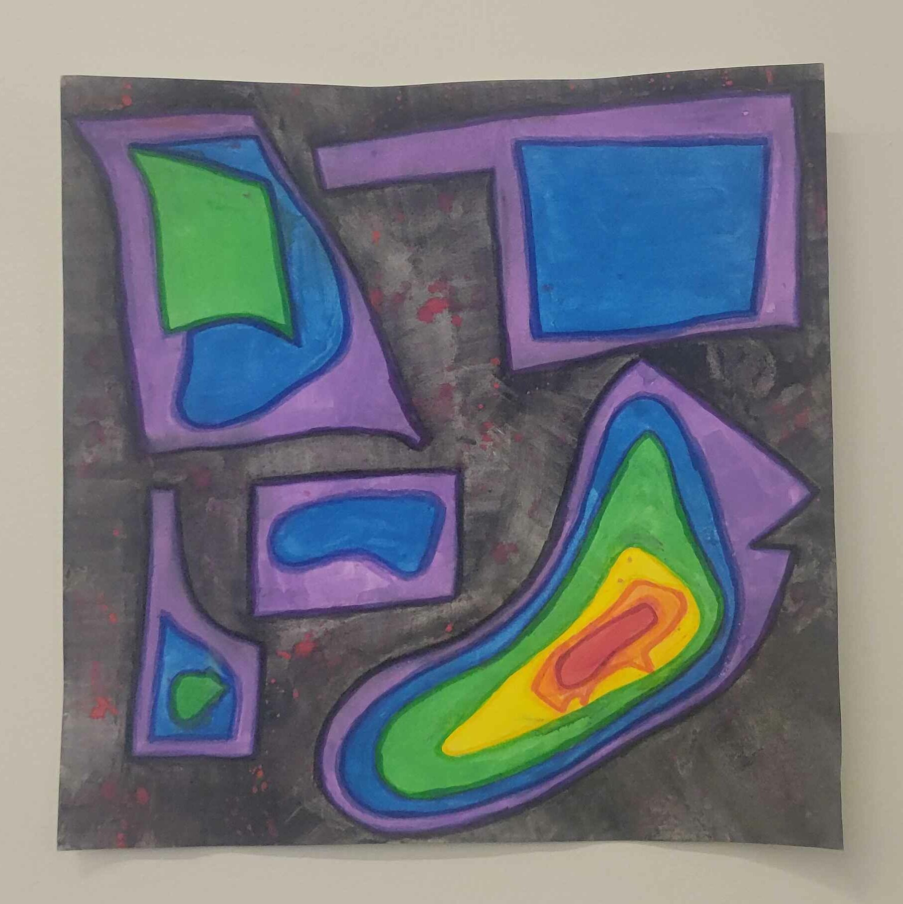
Today I’m coloring in the states in reverse-rainbow colors. As the height of growth goes up the color will change from purple, to blue, etc up to red as the highest spot. Here’s a screen capture of a map example to show what is going through my mind as I’m designing the different layers of this map.

There will be a section in the Missouri map where the blue and green don’t perfectly match the topographic map theme. This is my way of showing that I moved away and came back at a different growth level than before. The blue areas are the limited growth I experienced in this place as a child, and the green is the slightly higher growth level that I achieved elsewhere and brought with me when I moved back to that state. I’m pretty sure that this will not be easy for the viewer to understand, because it’s an abstract idea.

The yellow, orange, and red layers of the New Jersey section of this map have decided to not play nice. This may be my fault for adding too much water to the paper, or to the paint, but whatever the reason the colors have decided to bleed into one another a lot. I’m frustrated by this development, but also intrigued with the way the colors have played together. Because of the interesting way these colors have blended and shifted, I will be changing my design to incorporate these changed. Unfortunately, upon close inspection, a viewer can see the lines I drew to define the growth areas on the map. I don’t have a way to really fix this that doesn’t involve forcing the colors into those boundaries, so I’m going to just leave it. This is an interesting insight to how growth doesn’t always happen the way we want it to – nor does it always follow the direction we may think it should.

29 September 2024 – Work at Home
I’ve gone over the map with colored pencils and markers to help bring more definition to the different layers. This is something I’m particularly fond of in the yellow-orange-red region where the paints bled together. The way I have defined this pattern is a little bit chaotic, but also peaceful as I consider that there was a time when a small error like this would’ve made me re-do the entire project. There’s absolutely no reason to strive for perfection – perfection is boring, anyway – and this, to me, shows more about my own growth than any other example I could possibly think of. I’ve embraced the mistake, made it part of the world, and moved on without falling apart over it not being perfect.

So, here’s to growth. Here’s to peace.
Works Cited
Booth, Wayne C. The Company We Keep: An Ethics of Fiction. University of California Press, 2014.
Easterling, Keller. Medium Design: Knowing How to Work on the World. Verso, 2021.