Template Choices
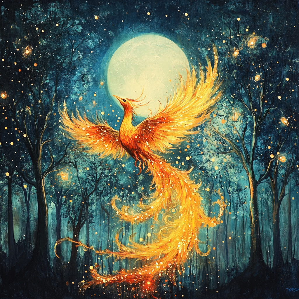
The first part of this project was to discover a magazine that I wanted to replicate using AI generative tools. Because my personal aesthetic runs more towards fantasy, goblin core, and the fae realm as a whole I decided to pick Enchanted Living, which used to be called Faerie Magazine. I went with an older style cover, based off of their Mermaids issue, pictured here:

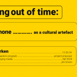
My grasp of using Macs is pretty bad, so the screen shot here includes the whole desktop, but it is still pretty easy to pick out the sweeping details of the design here. We have a mythical creature in a pose that sweeps through the center of the cover, surrounded by various article titles with a dual contrasting color scheme. Here we see white and yellow.
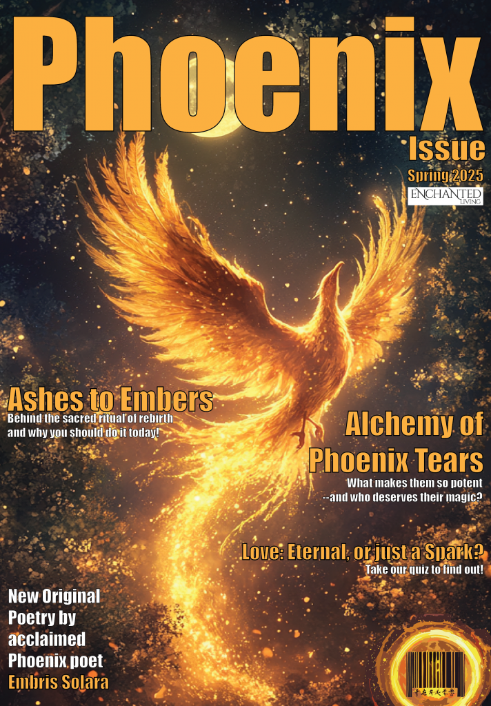
This looks like a more classic cover than the newer versions they have been putting out since they did a brand relaunch. Because of that, I thought it would be interesting to conceptualize a magazine actually written FOR a phoenix, if they were able to consume media without burning it to a crisp.
Design Process and Choices
I decided to use generative AI tool MidJourney Bot to design the image that would be the cover, which resulted in a slightly grainy image – however, as a deliberate design choice, I decided that it would be difficult to actually get a good resolution photo capture of a phoenix because of their speed and the brightness of their flames. Because I intended to highlight the flame and reborn aspects of the phoenix with my article titles, I thought a grainy image would perhaps be forgivable in this situation, and the final print version isn’t as horrible as I thought it would be.

I ended up choosing this image from the many iterations I played with because I loved the contrast and how getting closer to the image reveals more and more details. The only change I’d really like to have is the moon framed better in the wings, but because the bird’s head is not centered, I think it would draw too much attention to the asymmetry at play here. Having it where it is gives the eye an interesting line to follow. I would also have liked to make the title of the magazine line up in such a way that the moon was the O in Phoenix. However, because this is a small project and I can get lost in 1001 fonts pretty easily, I decided to let that slide. I picked the font IMPACT for the cover because it is thick and holds up well with a color fill and a small stroke at the different sizes used on the cover. While I know most magazine covers don’t use a stroke around their font, I really felt like the busy and dark background here necessitated those clean lines between the font and the background. This makes the fiery orange color pop a bit more and not get lost in the flames of the phoenix or the stars.
Image Iteration
MidJourney bot actually created several beautiful images that would’ve maybe even made better covers for this project, but this one was very compelling because of the high contrast colors and the fact that the phoenix almost mirrors the post of the mermaid from the magazine on the website.
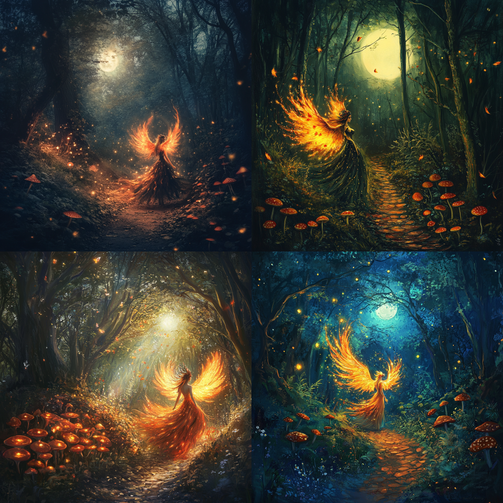
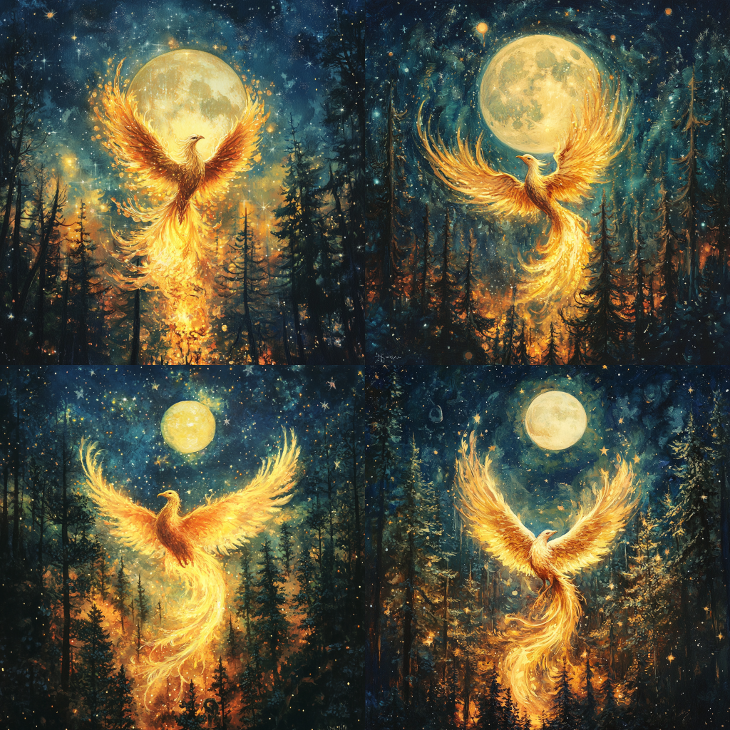
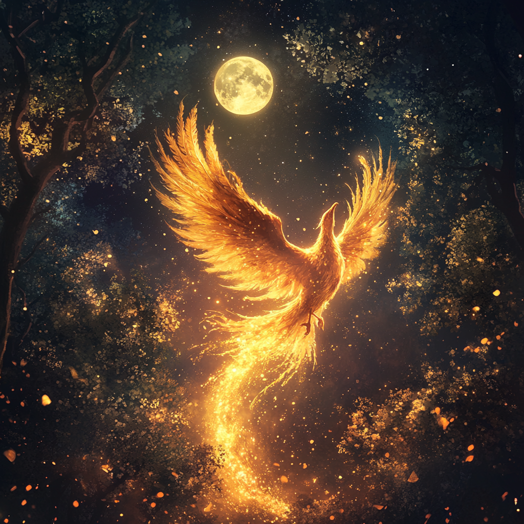
The images were difficult to choose from, because I wanted something vibrant and high contrast. In my pie-in-the-sky perfect version it would be a woman with long black hair and olive toned Hispanic skin who was half-transformed into a phoenix – so a human body with the large feathered flame wings, perhaps dressed in a dress filled with vibrant red, orange, yellow, and blue feathers to simulate flames. She’d be turned away from the camera towards a forest at a ¾ angle with her face turned back – a welcoming smile as her hand reaches back to lead the viewer forward into a dark and magical looking forest. However, this was a bit too complex for Midjourney to understand, so I went with a single bird-like representation of the creature since I couldn’t provide an accurate prompt for the AI.
Text Generation
For the text on the cover, I decided to use ChatGPT for help thinking up article names and loglines. This was an amusing conversation with the bot, which I have named Nova because I dislike talking to the program without humanizing it.

While I didn’t stick entirely to the suggestions made by ChatGPT, it did spark some pretty good ideas in my creative process. I did use, “Alchemy of Phoenix Tears” as an article title, but the logline I only used was “What makes them so potent–and who truly deserves their magic?” I also used the “Ashes to Embers” title, but I rewrote the logline to tie in the second half of the title with my own words, so it now reads, “Behind the sacred ritual of rebirth and why you should do it today!” This call to action reminds me of a lot of magazines that were popular when I was in high school such as Seventeen, Teen Vogue, etc.

Pulling from the cover of the Mermaids issue, I added in a section that was an artistic display of work by someone famous. I asked ChatGPT for help thinking up a name for this famous poet who was also a phoenix and I actually super liked the first thing it came up with. Paired with my memories of teen magazines, and some other magazines I have seen in the supermarket but never read, I decided to add in a “love quiz” as well, which ChatGPT came up with a good name for. I went with a more impactful title, altering it to read, “Love: Eternal or just a Spark?” I felt like this was a clever play on the phoenix theme while also being a shorter, more impactful read for a cover.
AI generated flare
One of the more interesting aspects of using ChatGPT is how it can anticipate the needs of the user. In this screenshot, we see the bot offering to create snippets of poetry to add flare to this design, which was interesting enough that I went ahead and had it generate a few samples to add to this design process book.

Design Elements
Title and Branding
Besides the obvious choice to follow the magazine cover template of the front and center model in a dramatic pose, there were other design choices made when creating this cover. For instance, on the top right corner I mirrored the magazine example by putting “Issue” to indicate that Phoenix wasn’t the name of the magazine. I also included the Enchanted Living logo (pulled from their website) which I would’ve preferred to make into a more cohesive design – (removed the white background, changed the font width, filled with the same orange of other titles, given a black stroke) – but I thought I was already diving pretty deep into this, so I didn’t edit that image before I put it on the cover. Looking at it now, I believe the logo actually looks good in such high contrast to the rest of the page. It really draws the eye to itself in spite of the bright fiery phoenix being the main object here. I also added “Spring 2025” to the top right corner, this is a nod to the fact that the mimicked magazine does quarterly issues.

Barcode
I’ve always personally found barcodes to be an affront to the design world. They take these bulky white and black blocks and just slap them onto a cover without any consideration for the aesthetic they’re destroying with their capitalist need to throw prices and money around. So, I thought it would be fun to incorporate the barcode into the design instead of leaving it as a boring box that disrupts the design flow.
There was some fighting that happened here with Firefly in Adobe Illustrator, because it always hallucinates the strangest things and comes out with wild results. The original image, which I didn’t save a screenshot of, was this artefact with the rings and a background of navy/black splotches filled with “stars” – which likely was a nod to the background on the rest of the cover. I had to ungroup the vectors of this creation and delete those weird background splotches which didn’t merge well with the aesthetic of the image because it was contained within a rectangle. I regrouped the vector after removing the background sections, and thought it looked vaguely like a coffee ring, or perhaps the corona of the sun throwing off solar flares. I’m not sure what language the glyphs this generated are meant to mimic, but I thought it was an interesting bit to keep on the image because it sort of adds a bit of mystery to the barcode.
Conclusion
Overall, I’m ridiculously happy with the design that I’ve come up with. While it isn’t the perfect design that I’d produce if I had more time and resources to put into this, it is a great representation of what I am capable of designing. Further considerations for this design would be brand kit information, customer preferences, and survey data of what works best for the client target audience. This was a project I definitely enjoyed pursuing and I can’t wait to get feedback to see how it is received!
Works Cited
Adobe Firefly – Free Generative AI for Creatives, www.adobe.com/products/firefly.html. Accessed 31 Jan. 2025.
Chatgpt, chatgpt.com/. Accessed 31 Jan. 2025.Midjourney, www.midjourney.com/. Accessed 31 Jan. 2025.
Midjourney, www.midjourney.com/. Accessed 31 Jan. 2025.